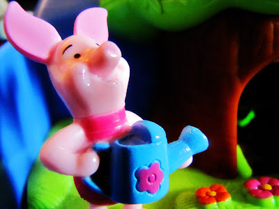
Sometimes the hardest part of writing this blog for me is coming up with a title. It's ridiculous.
I don't know about you, but this has been a strange sort of week for us. We haven't really had much going on, but it has felt so busy and rushed. To top things off, I am officially out of room on the laptop. That either means I need to start deleted some things off, or fork over some bucks and invest in an external hard drive. Or both. Oy.
Not helping my space issue is my addiction to fonts. I recently found Dafont and I.am.hooked! It has a ton of free fonts for you to download. If you are into fonts, check it out, but be warned...it's hard to leave the site!
Without further ado, here is this week's edit:
I honestly can't remember all I did, but I do know I duplicated my layer, set it to multiply, created a layer mask and filled it black and then painted back on with a 25% white brush (thanks, Ashley!). I also adjusted the levels to make the colors pop.
Then, just because I can (well, at least I think I can), I created some water drops, just for fun!
I just wanted to have some fun with it, but still keep it simple. Incidentally, I also gave Piglet a tattoo, but then I removed it. Poor little Piglet just doesn't seem like the tattoo type.
Here is the before and after. As always, your comments and suggestions are welcome. I really do appreciate them!
As usual, I'm linking up here:


Really nice pop! And the water droplets add a nice effect.
ReplyDeletePerfect edit. Just enough to make the colors pop a little more.
ReplyDeleteThe colors really pop! I'm wondering how you added the water droplets though. That seems a bit over my head. :)
ReplyDeleteI too really like how the colors now pop in your final edit! great job!
ReplyDeletegreat edits -- I like the pop!
ReplyDeleteAnd wow! those added water drops -- too cool! How'd you do that?????
I was getting addicted to fonts, too, but realized two things: pse would take longer to load the text tool. I was using the same 3 fonts -- why get more???
:)